How Fonts and Colours Influence the Feel of a Typographic Print
Typography isn't just about words—it's a full-bodied visual experience that shapes how we feel, engage, and remember design. In the world of modern typography art prints, the interplay of fonts and colours does more than just decorate a wall—it tells a story, evokes emotion, and creates atmosphere.
Let’s explore how fonts and colours come together in modern typographic design to influence mood, meaning, and memorability in a print piece.
What Is Modern Typography Art?
The Rise of Typography as Art
Modern typography art prints take the principles of visual communication and elevate them into standalone art pieces. These prints often feature inspirational quotes, punchy phrases, or minimalist compositions—crafted not just with words, but with the deliberate use of typefaces, spacing, and colour palettes.
Fonts as Emotional Messengers
How Fonts Shape Perception
Fonts, or typefaces, carry unique personalities. A font choice can project elegance, friendliness, authority, playfulness, or seriousness—sometimes all at once, depending on context.
Serif Fonts: Traditional and Trustworthy
Serif fonts like Garamond or Baskerville convey reliability, formality, and elegance. They're ideal for classic quotes or prints meant to inspire reflection.
Sans-Serif Fonts: Clean and Contemporary
Fonts such as Helvetica, Futura, or Montserrat are favoured in modern typography art prints for their minimalism and modern edge. They project clarity, openness, and approachability.
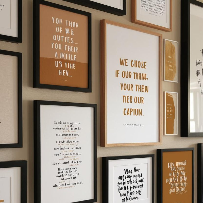
Script Fonts: Emotional and Expressive
Script or handwritten fonts inject a human touch. They’re often used in romantic or whimsical prints and are perfect for creating emotional resonance.
Decorative Fonts: Bold and Characterful
These fonts make statements. They often anchor a print's aesthetic, used in moderation to avoid overwhelming the viewer.
The Psychology of Colour in Typography
Emotional Associations of Colour
Colours, like fonts, communicate subconsciously. Here’s how some key colours influence the feel of a typographic print:
-
Black: Power, elegance, sophistication
-
White: Simplicity, clarity, minimalism
-
Red: Passion, urgency, energy
-
Blue: Calmness, trust, stability
-
Yellow: Optimism, warmth, cheerfulness
-
Green: Growth, harmony, balance
Colour and Font Pairing
The right combination of typeface and colour amplifies impact. For instance, a bold sans-serif in deep navy blue exudes confidence and professionalism, perfect for corporate or motivational prints. A delicate script in muted blush might suit a romantic or sentimental piece.
Visual Hierarchy and Readability
Font Size and Spacing
Hierarchy in typography guides the viewer’s eye. Larger font sizes denote importance; smaller sizes support the message. Effective use of line height and kerning ensures the message is legible and aesthetically pleasing.
Contrast for Legibility
High contrast between font and background increases readability—especially crucial in wall art where distance and lighting vary.
Trends in Modern Typography Art Prints
Minimalist Typography
Stripped-back fonts and monochrome palettes define modern elegance. Often used in Scandinavian-inspired interiors, minimalist prints rely on font choice and negative space for impact.
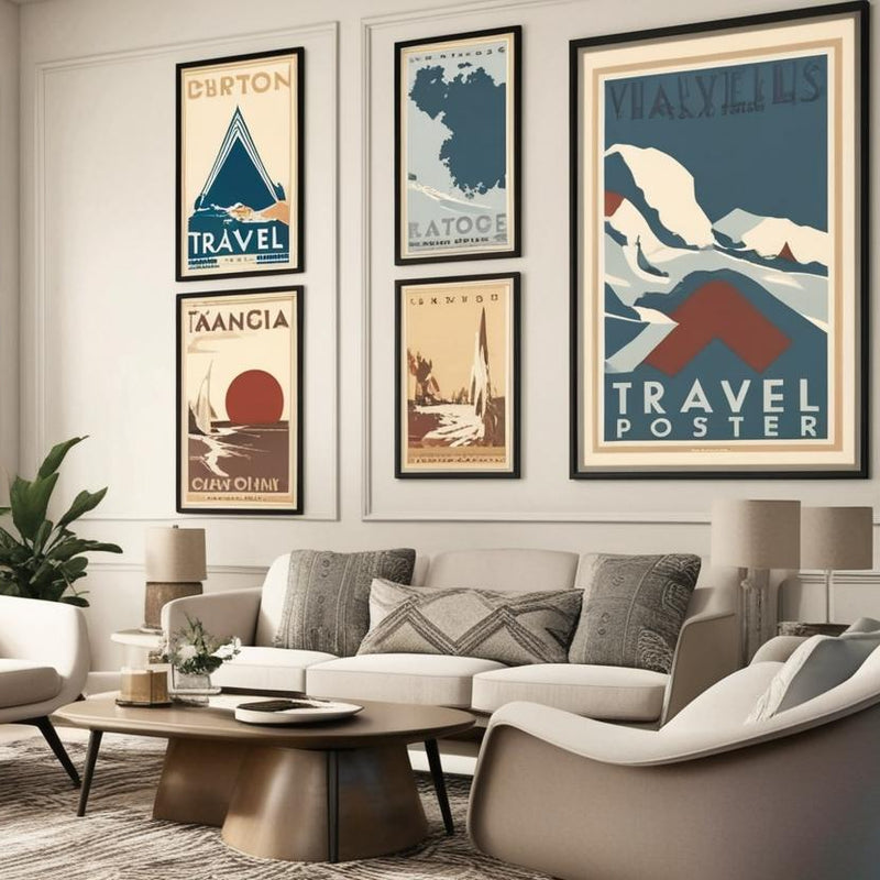
Retro-Inspired Type
Fonts from the 70s and 90s are experiencing a resurgence. Combined with bold colours, these prints evoke nostalgia while staying firmly modern.
Monochrome and Duotone Prints
Limiting the colour palette creates cohesion and sophistication. These styles are versatile for interior design, fitting into both vibrant and neutral spaces.
Typography in Home Decor
Setting the Tone of a Room
Typography prints aren’t just decorative—they influence the room’s emotional temperature. A dynamic print in a workspace can energise, while a calming serif quote in a bedroom can soothe.
Personalisation and Mood
Custom prints let individuals express personality through font and colour choices. This is especially powerful in gifts and statement pieces for personal spaces.
Choosing the Right Font for the Right Message
Emotional Intent
Ask: What emotion should the viewer feel? The answer guides your choice of font and colour.
|
Emotion |
Suggested Font Type |
Colour Palette |
|
Calm & Peaceful |
Sans-serif (e.g., Lato) |
Blues, greys |
|
Passionate |
Bold serif or script |
Reds, golds |
|
Joyful |
Rounded sans-serif |
Yellows, bright tones |
|
Elegant |
Classic serif or script |
Neutrals, black & white |
Best Practices for Designing Typography Art Prints
1. Limit Your Fonts
Stick to one or two typefaces to avoid visual clutter. Use font weights and styles to create variety instead.
2. Prioritise Legibility
Avoid overly decorative fonts for long passages. Ensure sufficient spacing and contrast.
3. Align with the Environment
Consider where the print will hang. Match font style and colour to surrounding decor for harmony.
Typography and Branding: When Prints Speak for You
Many modern typography art prints serve dual purposes—art and branding. For creators, designers, and small businesses, font and colour choices communicate identity. Think of a boutique using handwritten fonts in warm hues—it immediately suggests intimacy and craft.
Why Fonts and Colours Matter in the Age of Visual Branding
Every element of a typographic print becomes part of a visual language. Fonts and colours don’t just shape aesthetics—they shape perception. When used thoughtfully, they make modern typography art prints powerful tools for storytelling, inspiration, and self-expression.
For those seeking prints that combine design flair with lasting emotional value, The Canvas Works offers a carefully curated collection of custom prints and retro-inspired travel art. Based in Ireland and trusted since 2007, our expert team provides personalised service and superior-quality prints that truly stand apart.
Explore our latest designs or book a one-on-one consultation to create something genuinely unique—because your walls deserve more than the ordinary.